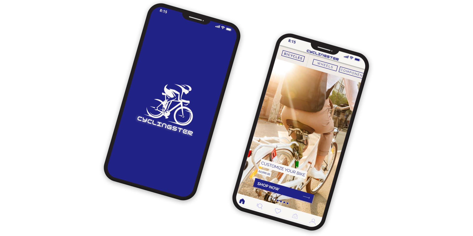
The Product
Cyclingster App is a bicycle shop that helps people to choose the best bike for themselves by offering customizable options. Their passion for innovation motivated them to meet the challenge of creating a one-of-a-kind bike that successfully combines extremely high performance and technical prowess with elegance and esthetics.
Project duration
January 2022 to March 2022
The Problem
The absence of fully customizable, stylish and durable bicycles altogether in one place
The Goal
Design an app for Cyclingster Bicycle Shop that allows users to easily customize and purchase durable and stylish bicycles.
My Role
UX designer designing an app for Cyclingster App from conception to delivery.
Responsibilities
Conducting interviews, paper and digital wireframing, low and high-fidelity prototyping, conducting usability studies, accounting for accessibility, and iterating on designs.
Table of Contents
1. User Research
2. Persona
3. User Journey map
4. Wireframes
5. Lo-Fi Prototype
6. Competitive Audit
7. Usability Study
8. Mockups
9. User Flow
10. Hi-Fi Prototype
11. Accessibility Considerations and Takeaways
User Research: Summary
I conducted interviews and created empathy maps to understand the users I’m designing for and their needs. A primary user group identified through research was working adults who use bicycles as a representative of their lifestyle.
The first user group mainly focus on the customization and improvability of their bicycles while covering their uniqueness. But customization fees are not cost-effective when they have to bring their bicycles to other shops to fulfil their needs therefore they prefer when they decide to buy they want to do customization in the first place.
The second user group mainly focuses on transportation and safety. They see cycling as renewable energy. They want reliable, durable and practical bicycles that they can use in their everyday life without facing any difficulties. They are willing to give extra money to upgrade their bicycles with electrically powered versions.
User Research: Pain Points
Uniqueness
Customization with affordable prices to have stylish bicycles
Long-lasting
Sturdy bicycles are essential for the users that plan to use them for a long time all day long in their life
Persona: Winston
Problem Statement
Winston is an Exclusive Graphic Designer who needs a customizable and affordable bike. Because he wants to show his uniqueness and wants to have extra features but he wants to have those customizable options when choosing his new bike.
User Journey Map
Mapping Winston’s user journey revealed how helpful it would be for
users to have access to a dedicated app such as the Cyclingster app.
users to have access to a dedicated app such as the Cyclingster app.
Paper Wireframes
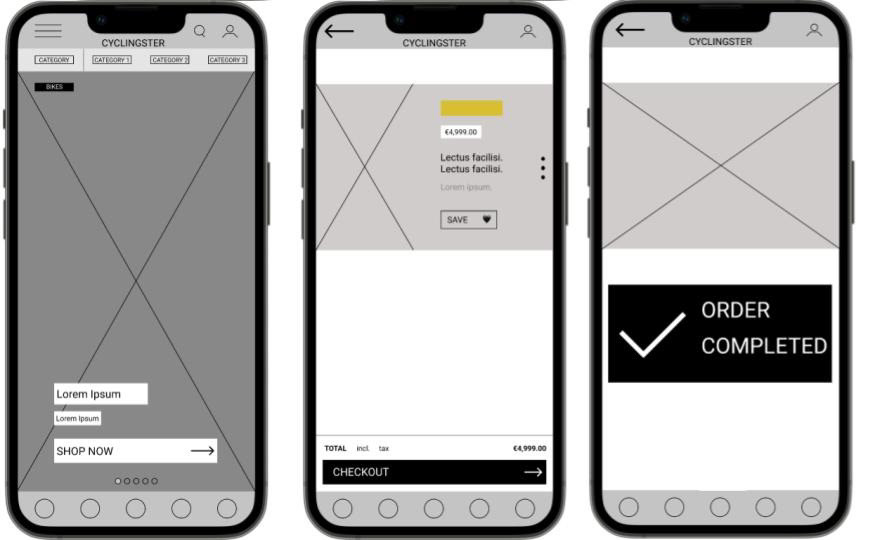
Taking the time to draft iterations of each screen of the app on paper ensured that the elements that made it to digital wireframes would be well-suited to address user pain points. For the home screen, I prioritized a quick and easy shopping process to help users save time while browsing.
Digital Wireframes
As the initial design phase continued, I made sure to base screen designs on feedback and findings from the user research
Low-fidelity Prototype
Using the completed set of digital wireframes, I created a low-fidelity prototype. The primary user flow I connected was customizing and purchasing a bike, so the prototype could be used in a usability study.
Competitive Audit
Competitive Audit Goal
Compare the user experience of each competitors’ app and website interfaces and features.
Who are your key competitors?
The key competitors are Luna Cycle, the US-based customizable bike shop (ships the products worldwide with limited options); Glory Cycles, the US-based online multi-brand bike retailer; and Briko Bike a French-based local second hand and used bikes/parts seller.
What are the type and quality of competitors’ products?
Luna Cycle has a well-designed website that communicates in a modern way with its users and does it so well. The website looks impressive with many features such as; remembering users’ payment info, completing the purchase as a guest, stunning first-person consumer reviews, massive customization options that premade packages along with customer choice upgrades. However, the worldwide shipping option is not clear, you can select almost every country but to see if they ship or not you have to write the city; selection is not possible. After writing the city the system notifies you about the possibility, otherwise, you cannot see if they do shipping to your location. Furthermore, it has almost no accessibility feature and works only in English.
Glory Cycles has also a well-designed website that communicates with its users as if a traditional world chain retailer that specialized in cycling. The website features almost similar to Luna Cycle but additionally, it is well organized and it has improved filtering features to help the users narrow their options. But like Luna Cycle it has almost no accessibility feature it has only an English language option.
Briko Bike is really different from the other competitors, it is a small business that focuses on collectors and old-bike users you can find almost any bicycle part. Different from Luna Cycle you can purchase necessary parts and establish your own bike on your own or with professional help. They offer so many tools that you are going to need. However their website has functionality issues, some menus are stuck when you scroll in the website, Easy to use but also looks more crowded and distracts the user while browsing. On the other hand, it has its own app for both apple and android. It works better than the website version and looks more clear. But if you want to use the website on your phone, it is not quite responsive.
How do competitors position themselves in the market?
Luna Cycle positions itself as a passionate new company that focuses on reserving the trend of overpriced, slow and ugly e-bikes. They focus to offer top-quality powerful products at an affordable price. They mostly build their bikes and batteries in the US some parts are coming from China. Even though they do sells worldwide (limited options) they only serve in English.
Glory Cycle is an online seller since 2001. Glory Cycles is a multi-channel merchant specializing in road racing bicycles, components and apparel. They are authentic as the brands they carry, they bring products and buyers together with their unique mix of sales and marketing channels. But again even though they are one of the top (2nd) online multi-brand retailers, they only serve in English.
Briko-Bike is a small French company born in 2008 and based in Toulon in the Var. The name "BRIKO" was originally set up as a blog of the DIY former bikes (which still exists to this day. As a great enthusiast and collector of old bikes they have accumulated over time a lot of parts and it seemed obvious to propose to other people in the form of exchange or purchase. Their network in the middle of the former bike growing up allows them to find and regularly buy new parts from old stock. They are basically indirect competitor but also allows users to customize options. Their target group is the ones still using their old bikes or collectors.
How do competitors talk about themselves?
Luna Cycle markets itself as a place for affordable unique customized bikes with offering top quality service and brand identity.
Glory Cycle markets itself as a top retailer in the industry by offering various products, bring products and buyers together.
Briko-Bike markers itself is a local second-hand shop offering rich used/old bicycle parts but also serves the global market.
Usability Study
Project Background
Cyclingster App's aim is to help people to choose the best bike for themselves by offering customizable options. For this purpose, I needed to find out if the main user experience, finding and purchasing a new bike, is easy for users to complete.
Research Questions
1. How do people approach using the app when they know they can make the customization on purchasing a bike?
2. Which group of users mostly want to customize their bikes?
Participants
• 5 participants (for each usability testing)
• Two males, two females, and one nonbinary individual, between the ages of 19 and 55. One participant is a person with a visual impairment.
Methodology
• 15 minutes per participant
• World-wide, remote (online)
• Unmoderated usability study (for Lo-Fi)
• Moderated usability study (for Hi-Fi)
• Users were asked to perform tasks in provided prototype
Usability Study: Findings
Round 1 Findings
1. Users need a clear purchasing process
2. Users need detailed customization options
3. Users need a clear saving option for the products
Round 2 Findings
1. Users need more customization options
2. Users need to be able to edit products on the checkout page
Themes
Most participants need to see a clearer purchasing process
• 4 of the 5 participants found the app easy to use.
• 3 of the 5 participants found purchasing process not clear enough.
• They want to see a final check-point to see what they order and to where.
"I wasn't sure I did add the item into my basket and that checkout screen felt like appeared from nowhere."
Most participants couldn’t find the save button on their first attempt
• 3 of the 5 participants couldn’t find the save button on their first try and one of the participants couldn’t complete the task
"I couldn't complete this task, unfortunately"
Mockups
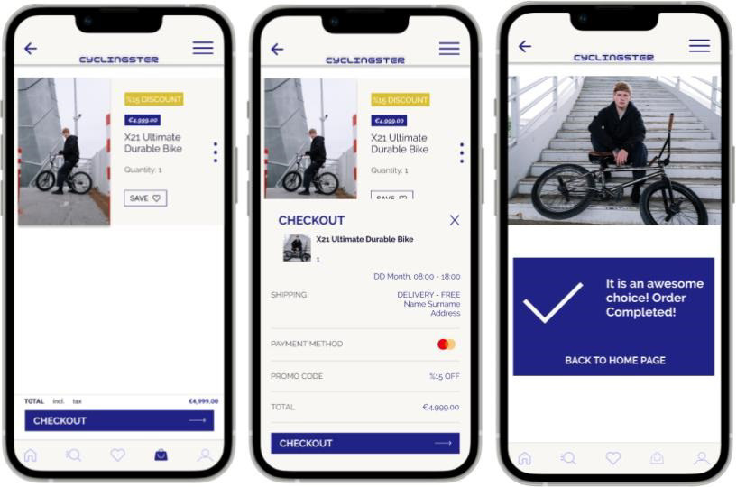
Early designs allowed for some purchasing process,
but after the usability studies, I added additional features to complete the purchase. I also revised the design so users see all the purchasing processes on one screen when they decide to continue to buy. They can see all the necessary information on one page. Also, allow them to return the home page after purchasing.
but after the usability studies, I added additional features to complete the purchase. I also revised the design so users see all the purchasing processes on one screen when they decide to continue to buy. They can see all the necessary information on one page. Also, allow them to return the home page after purchasing.
User Flow
Onboarding

Homepage
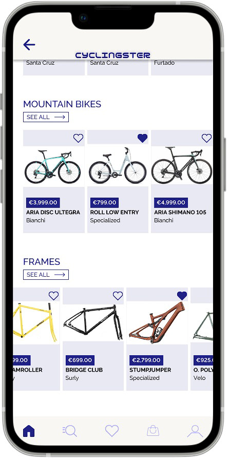
Category Page

Product Detaiils
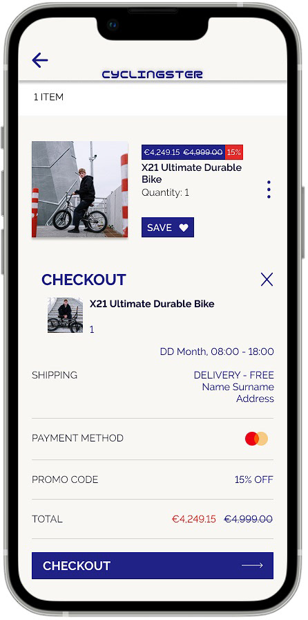
Checkout
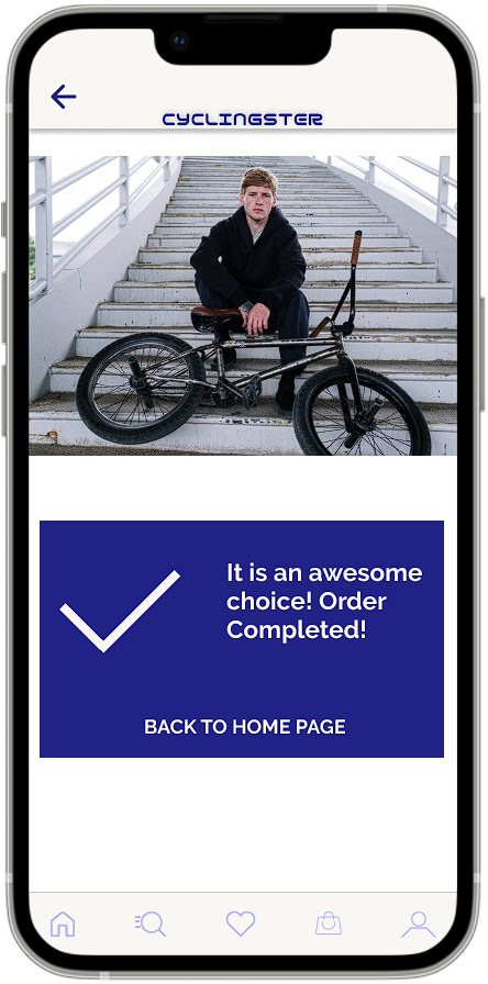
Order Confirmation

Account Settings
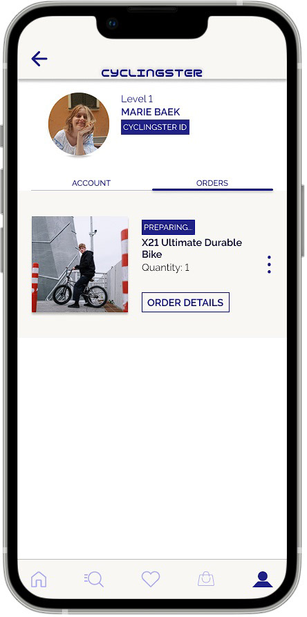
Order Track

Login Screen
High-fidelity Prototype
The final high-fidelity prototype presented cleaner user flows for purchasing a bike and checkout. It also meets user needs by offering customization options.
Accessibility Considerations
1. Used icons to help make navigation easier.
2. Used detailed imagery for bikes and indicated icons to help all users better understand the designs.
3. Provided access to users who are vision-impaired through adding alt text to images for screen readers.
Takeaways
Impact:
The app makes users feel like, the Cyclingster app thinks for them and really allows them to match their needs and helps them to find the best bicycle to show their personalities.
What I learned:
While designing the Cyclingster app, I learned that the first ideas for the app are only the beginning of the process. Usability studies and feedback influenced each iteration of the app’s designs.
Let's Connect
Thank you for your time reviewing my work on the Cyclingster app! If you’d like to
see more or get in touch, my contact information is provided below.
see more or get in touch, my contact information is provided below.
